Comparing two websites both featured by Site Inspire
I consider myself an advocate for design accessibility and it’s a topic that I’m happy to educate others on. The checklist to make a website accessible can be overwhelming if you’re a newcomer. I always find it best to see (no pun intended) real life samples to gain a better understanding of how problems are manifested.
I’ve pulled two websites featured on Site Inspire, a site that I often look to for web inspiration. Let’s see how these two sites compare when it comes to accessibility standards.
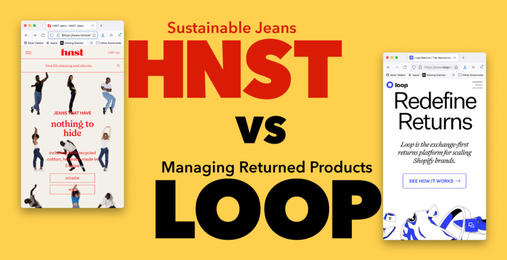
letsbehonest.eu
Hnst is a European men and women’s sustainable jean brand that immediately drew my attention because of their site’s color palette. The bright red on this pale yellow and orange created the feeling of something aged like the paper sleeve of an old record. It’s a beautiful color palette that doesn’t meet web contrast standards.
Their brand’s color barely meets the requirements for large text on the pale-yellow color with a contrast rating 3.43 to 1. On the pale orange, the color doesn’t even meet the standards for large text at 2.78 to 1. The minimum standard for large text is 3:1 and for normal text is 4.5:1 according to WebAIM. Solving for color issues can be a frustrating fix as companies will have already invested in merchandise with this color palette having carefully picked out these colors early in the design process. It’s essential that brand designers take contrast into account before even presenting a logo to a client to avoid this issue. My suggestion would be to have two shades of red incorporated into the website. Darker red on the off yellow and the logo red on the orange field. The background orange color will also require to be lightened.
The structure of their site is also disappointing with their use of the header element. Header elements act as a table of contents for screen reader users to understand what content is on the page and to navigate more efficiently. I was surprised to see they only had 2 instances of using header even though much of the site has large titles throughout the home page. They use a combination of div classes instead which is not best practice for the reason I just stated.
Please add alt text. It isn’t difficult. Alt text should describe the images of the site to create an understanding that screen readers wouldn’t understand otherwise. The fix is a simple one and doesn’t require much effort from the site manager. In this instance, they’re using images of text which won’t help your site be responsive to different screen sizes.
Grade: D for Dreadful
loopreturns.com
The second site I’m reviewing specializes in helping emerging shopify brands in managing returned products. You can tell immediately that the black, blue, and white color palette clearly meets contrast standards.
This site is a better example of how to use headers as well. H2 headers are followed by descending H3 and H4 headers. A screen reader would be able to navigate this site much for efficiently in comparison to the former.
A frequent mistake I see happens with forms. Designers love to keep things sleek and concise when they can. Often they will omit the form label and use the name field to add ‘Email’ or ‘First Name’ keeping it with the boundaries of the container. The problem is that screen readers rely on the ‘label’ to understand what the form is asking to be filled in with.
The decision of what typeface you choose may not make or break your site on whether it’s accessible or not but it does help the cause. Fonts with humanist elements or features can provide an added benefit to some users, “Varied character widths aid character recognition for people with all types of eye condition or learning disabilities.” (Williams, 2020) Both sites make use of this trend. Though large amounts of italics are usually not the best for the after mentioned group as well. I believe Loop uses it sparingly enough but it’s something I would advise other designers to be aware of while they design a site.
Grade: -A for almost there