Design Researcher/Art Direction
Design Question: How do we create an interactive installation that communicates the impact of food from a personal to global scale to young adults living independently?
Tools: Illustrator, Figma, Reality Composer
Client: Dr. Rachel Hann, Dr. Gabriele Ferri, Northumbria University
Team: Miriam Loos, Obafemi Omitiran, Samaria El Massaoudi, Yagmur Aydogmus, Zachary Manning
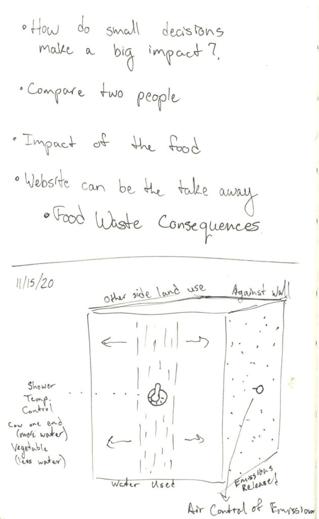
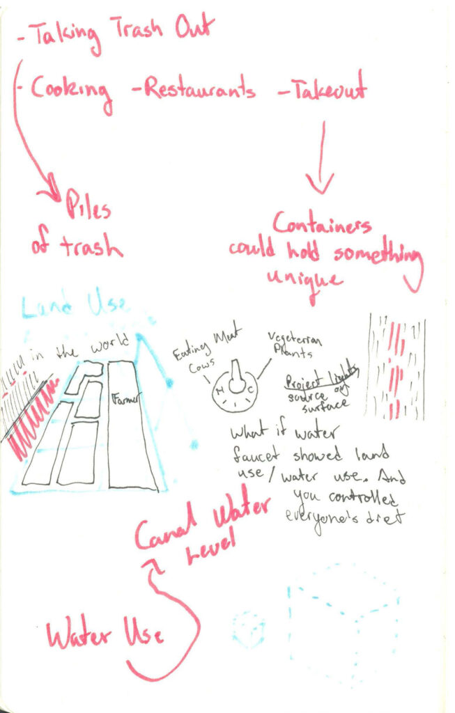
Research
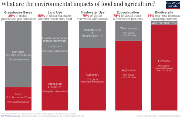
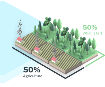
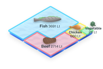
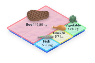
Stats on the environmental impact of select food groups inspired our future visualization
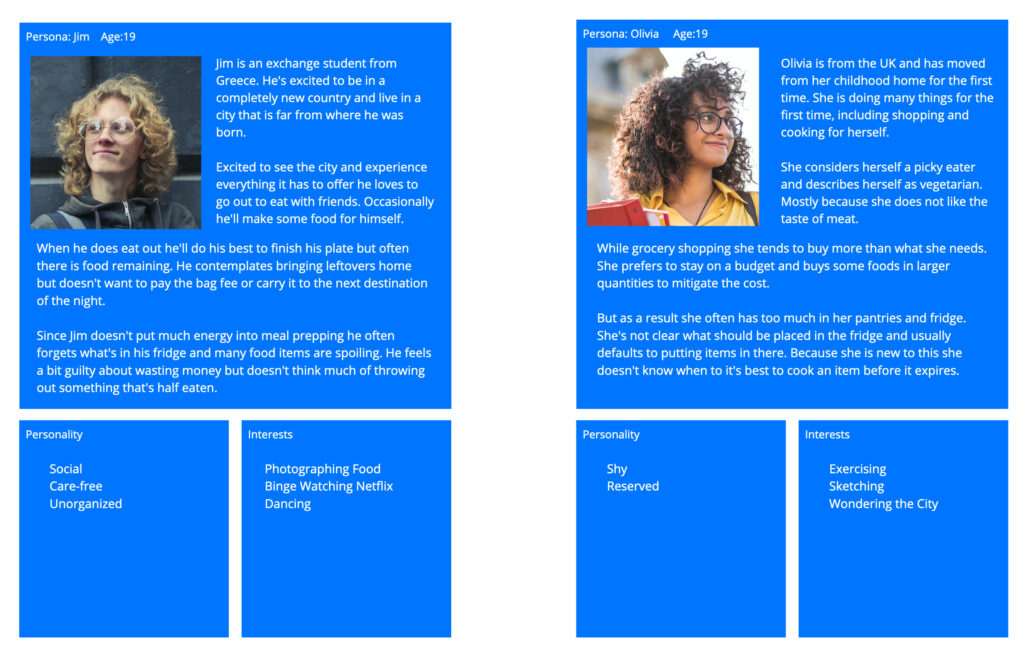
Personas: We determined that young adults living alone for the first time wasted the most food
Mapping Observations
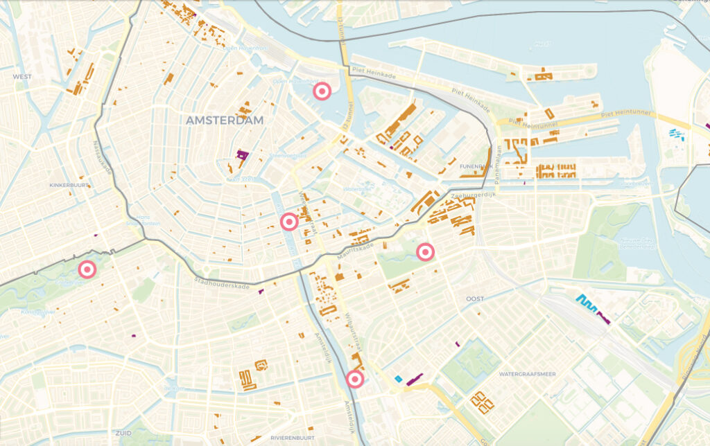
The dark orange shade indicates university student housing. We were therefore able to conduct tests in locations that were trafficked by our target group.
The targets are either successful locations or areas of the city that we believed would be ideal for our installation.
Sketching Concepts
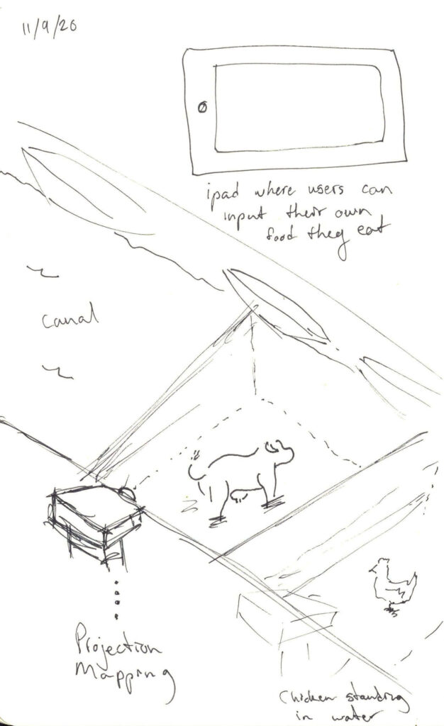
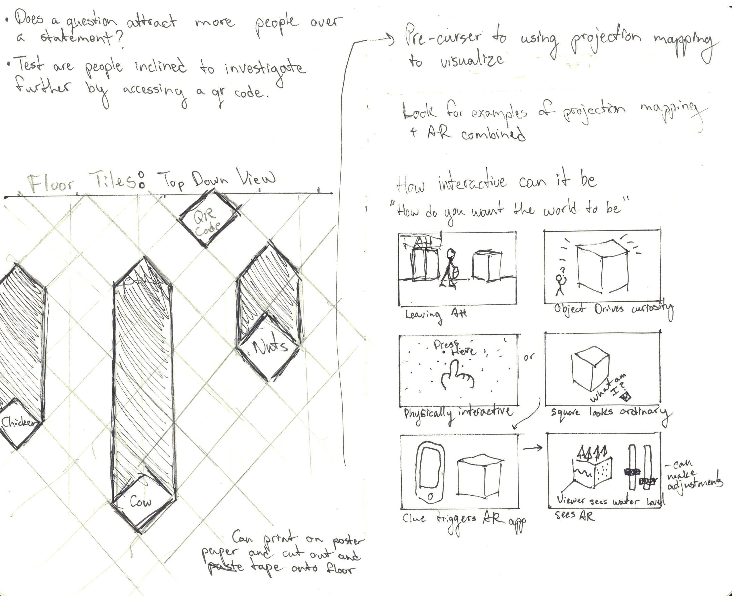
Sketch of Final Concept by Yagmur Aydogmus
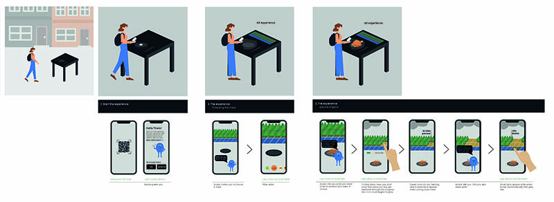
Storyboard
Utilizing the concept of defamiliarization we aimed to introduce a table with a plate and cutlery into a space where these things wouldn’t be expected to be found.
A QR code would initiate the experience further, leading to the AR experience.

Testing Locations
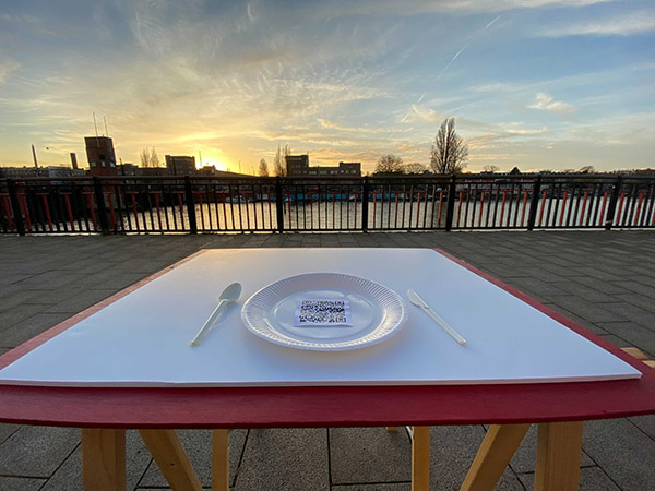
lo-fi table at sunset
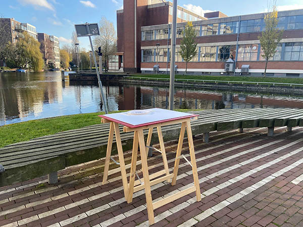
lo-fi table prototype
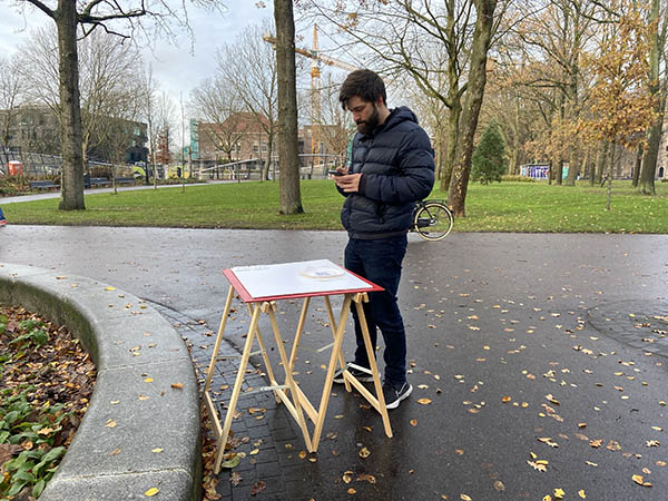
man interacting with the table/QR code
3D Elements
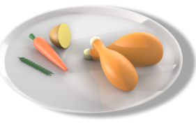
We opted to create 3D renderings that were cartoonish rather than trying to mimic reality. This allowed us to create more 3D renders in a shorter amount of time.
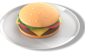
3D elements designed by Miriam Loos and Yagmur Aydogmus
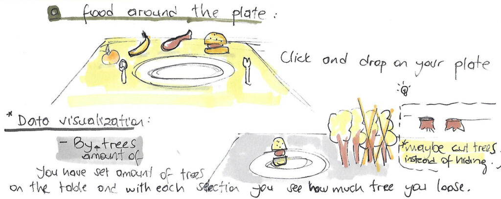
Gameplay
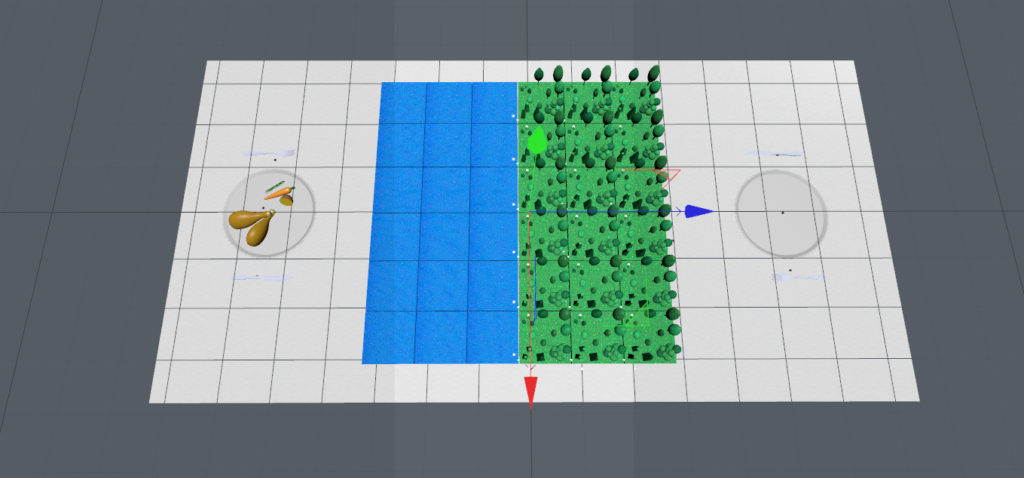
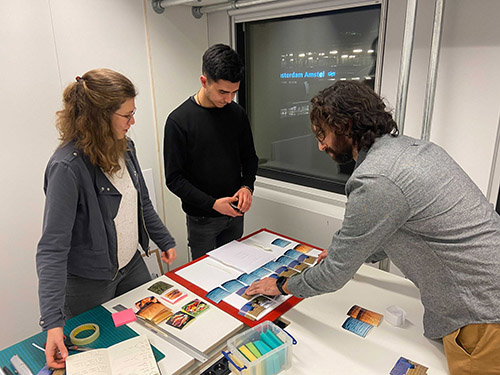
Making and testing our lo-fi game experience allowed us to better understand what users wanted or were curious about.
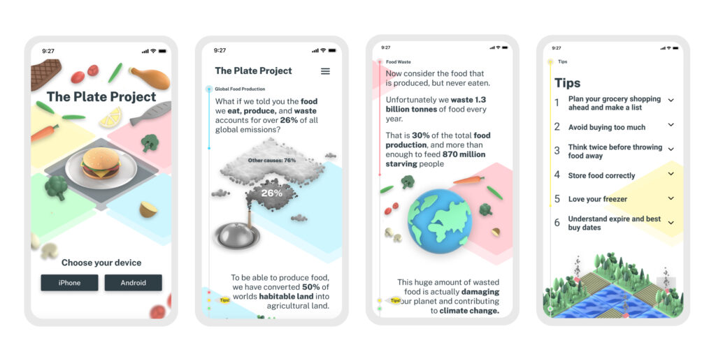
Website & Infographics
I created a mood board with mobile design kept specifically in mind. Our website will be mostly viewed on mobile devices so we paid specific attention to that layout. The typeface we went with ‘Pass Through’ is more condensed and can fit large text in tightly into this smaller space.
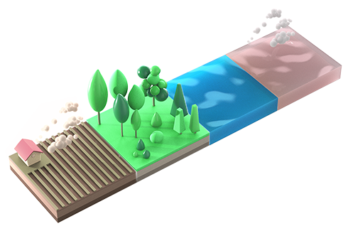
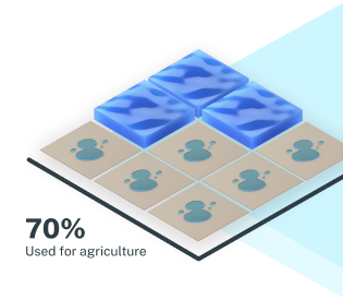
The website relies heavily on these 3D rendered infographs that make complex information easier to understand.
Our project can be divided into three problem spaces and into three solutions.
- Catch passers-by attention. We introduced a defamiliarized object (table, plates, and cutlery) into a public space.
- Interactive Installation & Initiate Debate We created an AR experience that passersby can initiate with their mobile devices.
- Give more information Lastly we provided these individuals a website with visualized data that they can take with them.
As a group we all contributed to the research and ideation phase. At the mid-point of the project I was involved in all the testing of our prototypes. (Location & Gameplay). Lastly I was involved with the design and creation of the website.