Designer
Goal: Visualize an emotional journey over time and create a mood tracking app that allows others to do the same. Visualizing their life through color.
Tools: Illustrator, Figma, Vue.js, p5.js, Design Research
Client: N/A
How it Started
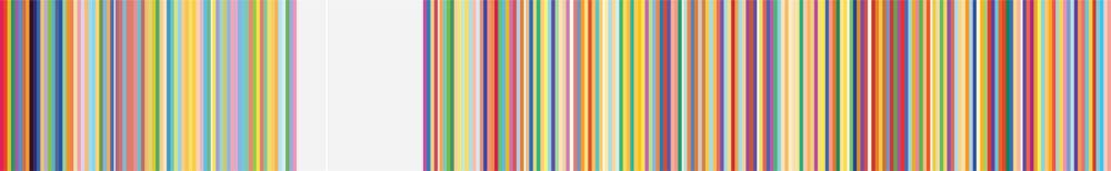
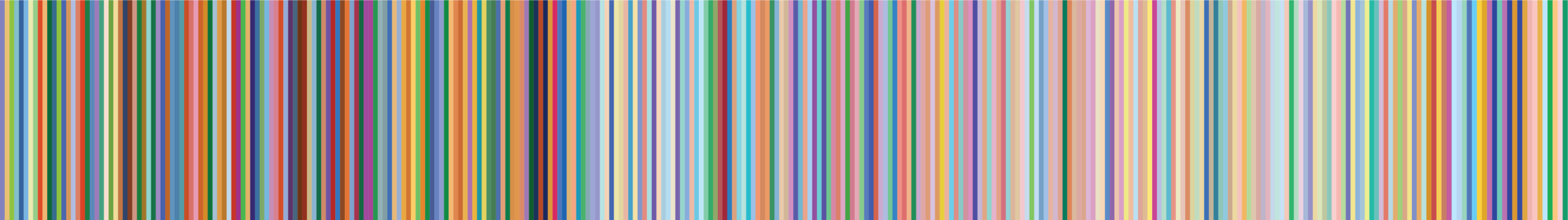
Each night for the past three years I’ve written a short entry anywhere from a single word to paragraphs of text. After I’ve written what I’ve wanted to record I select a color that I feel best represents how I’m feeling at that moment, via the RGB code.
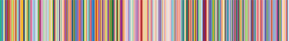
The result is a visual representation of my emotional journey over this time. It was only this February that I began to share monthly squares of these color blocks on Instagram creating a mostly anonymous page. This past April was a challenging month for me and it was reflected in the colors that were chosen. Usually, I share these color blocks without any explanation but I felt otherwise this time around. I shared an Instagram story detailing my struggles: dealing with the aftermath of a relationship ending and the pandemic that was sweeping through the New York area. This is one of the messages that I received from a friend in response to my post: “So rarely on social media do we get a glimpse of genuine emotion, I appreciate this.” -Michelle Brodbeck
User Journey
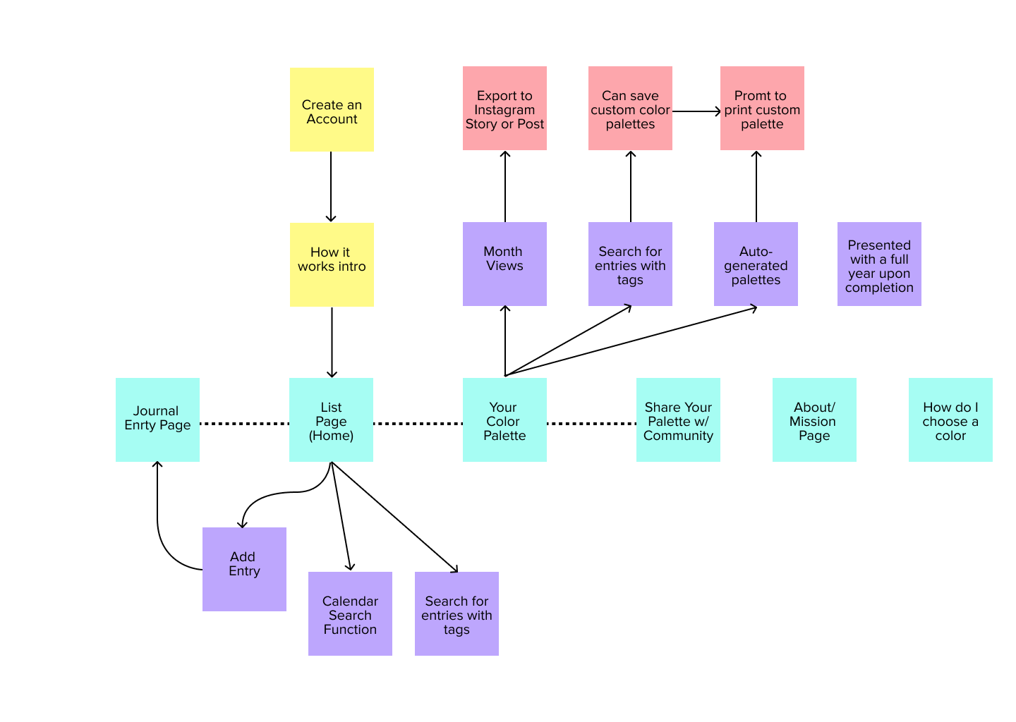
Yellow indicates how users are introduced to the app. The light blue are pages that users can toggle through. Purple represents actions that can be taken within that page. Red indicates actions that users can take to export their color palette physically or digitally.
Wireframes


Where it is Today
I initially started this project for myself without considering that others might be interested in similarly documenting their lives. In my first semester for my master, I began the process of creating an application for others to do just that.
“I’m curious how many understand you or perceive you. Can people recognize how you’re feeling?” -Miriam (Interviewee)
One of the features of the app will be creating custom color palettes and monthly reports that users will have the option of sharing if they so choose. Many I’m sure would not share this and perhaps keep the hardest months to themselves. But I hope that some will share it to be more transparent with their own lives. That it is ok to be sad or upset and that not everyone’s lives are filled with happiness every day. Perhaps I’m too much of an optimist but I hope that the pendulum will swing the other way and that this could be a part of a trend among some to share something deeply personal not to impress one’s tribe but to level with them. That you are not alone in these emotions and it’s only human to feel this way.


Color Research
Goal: Research the correlation between colors and the current state of emotions amongst adults.
Team: Aljoscha Gleser, Miriam Loos, Zachary Manning, Robin Tepe
While attending the Master in Digital Design program at AUAS a team and I conducted research into discovering a commonality between an emotional state of mind and a visual color correlation.
Methodology
A form was created that was distributed to 50 individuals. In our prior research, we saw that often studies limited their participants to choosing one emotion or mood. We then gave users the option to choose more than one term to best describe their present mood.

Developed by Miriam Loos
Results: Emotional Chart
To the right are the plot points for each submission. Dots that are positioned on an axis to one another have the same coordinates.
With these results, we can see that a tendency is forming at the far end of the calm spectrum. The purifier of dots are mostly blue with some green and purple dots on the outermost end of the chart.
Oranges and yellow are found mostly on the energized half of the chart but are almost evenly distributed between pleasant and unpleasant emotions.
Feel free to reach out for a pdf of the full detailed report zfmanning91@gmail.com